One of the projects I’ve been working on during the winter break of 2024/2025 is a video game for getting started with R. I’m usually thinking of new ways to communicate and share knowledge during my spare time. I’ve written a website (RGalleon.com), written a textbook (An Introduction to R for Non-Programmers), and taught short courses and in university setting on various aspects of R, Python, and/or SQL.
Developing the Video Game
However, I’ve been noticing that many of my students are now on their phones – all the time! I tried to think of a way that I could connect and share my expertise with those individuals better. In the summer of 2024, I tried developing an app, but it got put on the backburner. However, I buckled down during the winter break and made some serious progress. I tried my hand at Ren’Py, as it is python-based. This made it much easier for me to develop the video game as I already know python, so the syntax was easier for me to pick up and learn over other video game engines. Ren’Py also has a feature that exports your work to XCode for iOS development. (It has some small bugs when porting the game, but does so much of the work that it is still VERY helpful.) At this point, I have a game that works and has the main functionalities that I want.
Below is the opening screen:
The Basic Look and Functionality
Once the user starts the game, they will see a screen that looks like this:
The goal of the video game was to look like a phone texting conversation. I am hoping that it makes folks on their phones a lot more comfortable with the experience. By pressing the play icon, the user can progress the conversation. At certain points, the user will have different options to select. Their choice will prompt potentially different responses. Below is an example of the user’s message and the subsequent responses:
Since the app doesn’t have R built into it, I decided to include images of output so that the user can see what code will look like in R. Here’s an example of that:
The user will be presented with questions throughout the conversation. During these points, the user will have to make different choices. If the user makes an incorrect choice, the Professor character will explain why the choice is incorrect, and will give the user another chance to select the right solution. Once the user selects the right answer, the user will be able to progress.
Looking Forward
At this stage, I am still working out some kinks and polishing the game up (i.e., removing some buttons, including a tutorial for navigation, etc.). I hope to be able to release is during the first quarter for 2025 – so please stay tuned! 🙂
Disclaimer: Before making any investment decisions based on this (or any financial content on the internet) analysis, consult with a financial professional (https://www.youtube.com/watch?v=ILsXSJeF9Xc). This blog post is for informational and educational purposes only.
In the world of investing, choosing the right index fund can be a daunting task. Two popular options are the Dow Jones Industrial Average (DJIA or sometimes abbreviated here as DOW) and the S&P 500. This post explores their historical performance to see if one might be a better choice. If you are interested in learning how to perform analyses like this, consider one of my data science courses: https://wp.me/P5xMk4-5p
Methods
We utilized different methods to compare and contrast the indexes. Some of these were traditional, such as computing helpful summary statistics of the returns (such as the average return). We also calculated different moving averages as a useful benchmark to obtain medium to long term performance.
We also performed a more sophisticated approach to understand the returns of both indexes called the bootstrap. To understand the bootstrap, imagine you have the historical return data for both the Dow Jones and the S&P 500. The bootstrap algorithm is a fancy way to create many “fake histories” of returns, helping us understand how reliable the statistics we calculate from the real data might be.
Here’s how it works:
Resampling with Replacement: Think of randomly grabbing returns from your data/historical returns/history, but with a twist: you can put them back in each time! This allows you to create a new “fake history” with potentially duplicate years.
Creating Many Fake Histories: We repeat this grabbing and replacing process hundreds of thousands of times, creating a whole collection of these “fake histories” for both DJIA and S&P 500. Each fake history has the same number of years (like 30) for each run, but the order and sometimes even the specific years might be shuffled around.
Analyzing Each Fake History: Now, for each fake history, we calculate statistics like average return, just like we did with the real data. This gives us a sense of how much these statistics would vary if things like random chance influenced which years we picked. From these statistics, we can even describe the distributions of these statistics.
Why it’s Useful for Comparing Distributions:
By repeating this resampling process a large number of times, the bootstrap generates a distribution of summary statistics (mean, median, standard deviation etc.) for both DJIA and S&P 500 returns. This allows you to:
Compare Variability: Analyze how much the summary statistics (like mean return) vary between the two indexes. A wider spread in the bootstrap distribution suggests more variability in the statistic.
Distribution Shape: Visualize the distribution of these statistics using techniques like histograms or density plots. This can reveal if one index has a more skewed distribution of returns compared to the other.
By comparing the bootstrap distributions of the DJIA and S&P 500, we’ll gain a deeper understanding of how consistent their returns are, how much they might fluctuate, and any potential differences in their return distributions. If you are interested in learning how to perform the bootstrap in situations like this, consider my data science bootcamp: https://wp.me/P5xMk4-5p
Initial Analysis
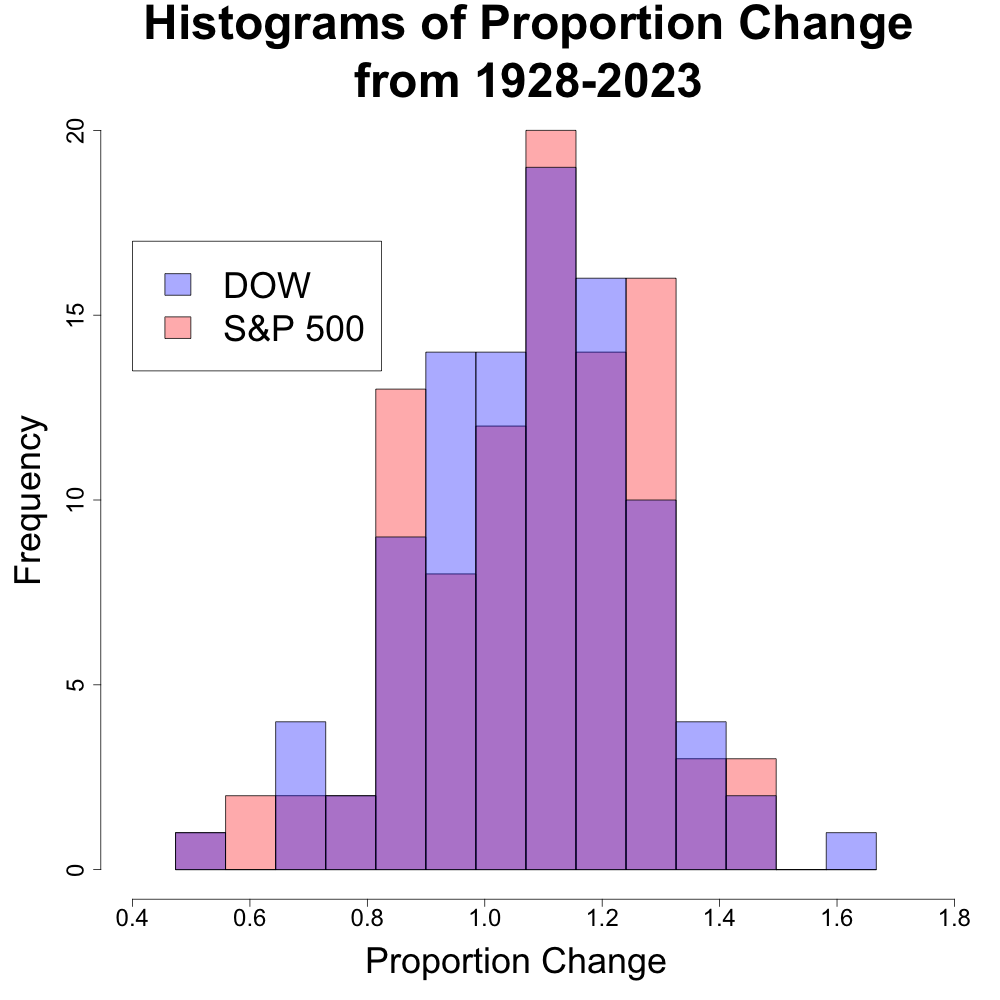
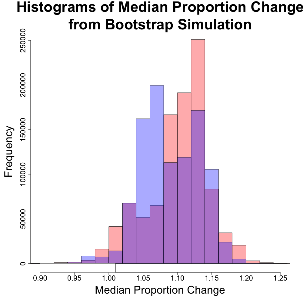
We compared the annualized historical returns of the DJIA and the S&P 500 over the same time period (1928 to 2023). While initial plots suggested the Dow Jones might even outperform the S&P 500, further analysis revealed a different story. The code and output from this analysis is provided at my GitHub link: https://github.com/billyl320/sp500_dow_compare
The above plot represents the returns as “proportion change”. Proportion change is defined to be the annualized return change. For instance, a return of 40% would equate to a proportion change of 1+0.40 = 1.40. A return of -40% would equate to a proportion change of 1-0.40 = 0.60. We can see that the histograms of the proportion change is fairly similar. There is even an (albite very very unlikely) chance that the DJIA may have years of the greatest return due to have the maximum value across both indexes.
Average Returns Are Similar
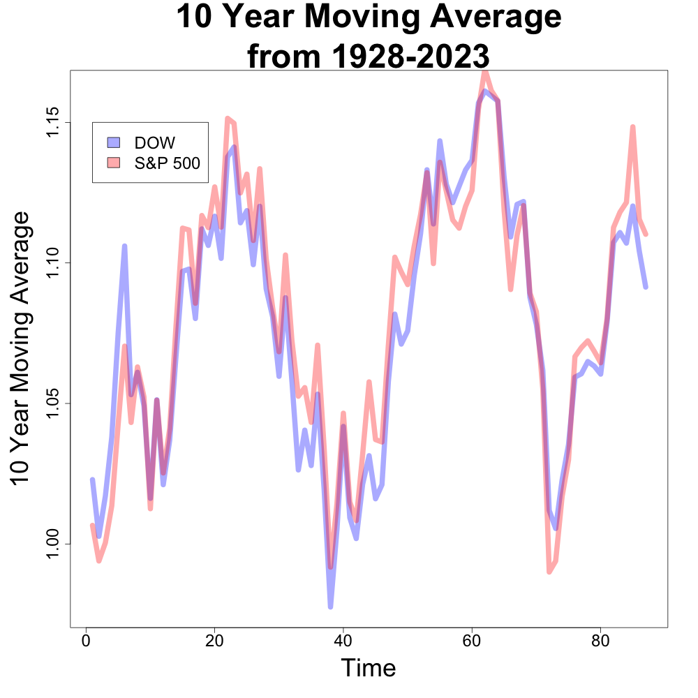
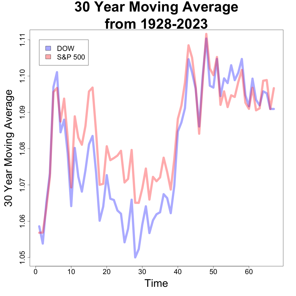
Financial experts often cite similar average returns for both indexes across different time periods [1, 2, 3]. Our analysis confirms this. While both indexes have experienced periods of strong growth and decline, their long-term average returns tend to be close. Below are the 10 year and 30 year moving averages of both indexes. (This is especially true in more recent years.) The x axis is time where the larger values indicate more recent years.
Median Returns Tell a Different Story
However, looking deeper, we found a larger difference in the medians. Recall that the median represents the “middle” value in a dataset, where half is less than the median and the other half is greater. The average or mean does not guarantee to have half of the data on either side of it.
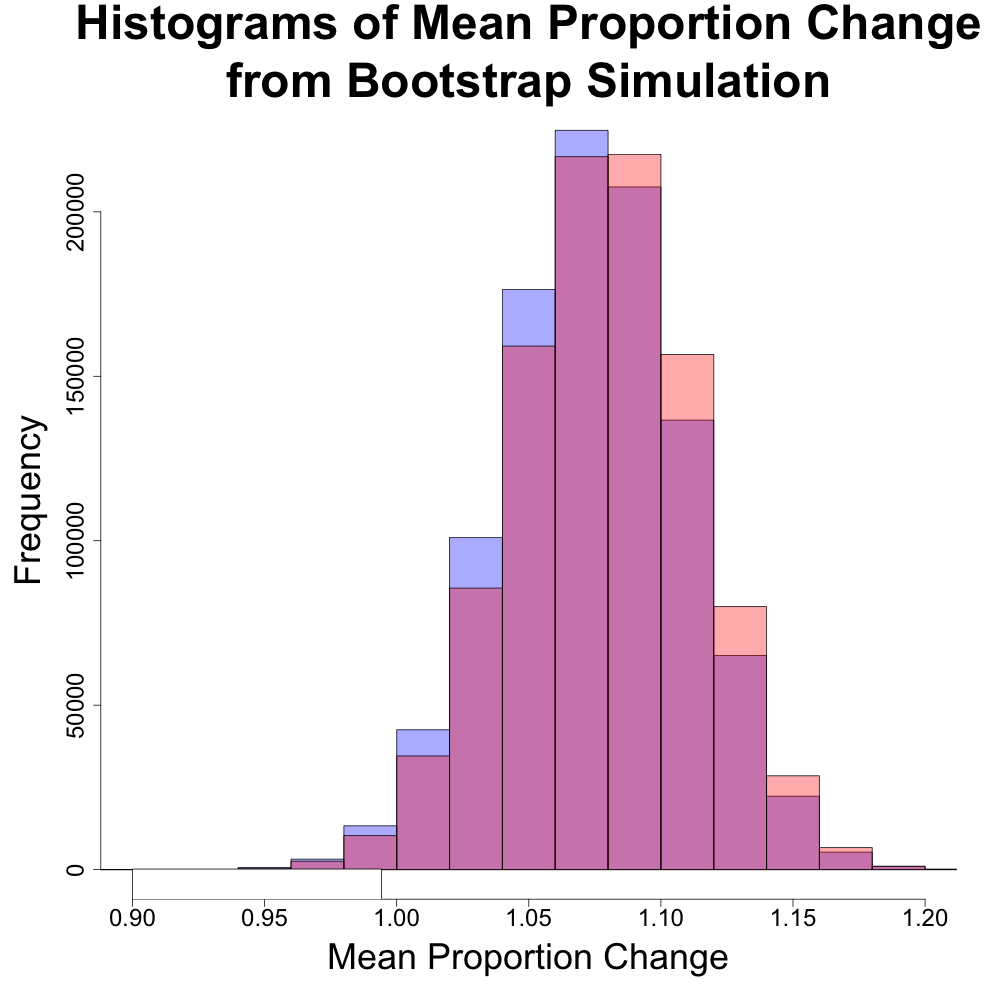
The above histogram compares the distributions of the means of the DJIA and S&P 500 (in blue and red, respectively). The distributions are very similar and would suggest that either index would give similar rates of performance.
The above histogram compares the distributions of the medians of the DJIA and S&P 500 (in blue and red, respectively). The distributions are very different and would suggest that either index behaves differently. The DJIA has two peaks, one closer to a 5% annualized return and one closer to 15%. The S&P 500 has one primary peak around a 15% annualized return. This suggests that it is more likely to have higher returns with the S&P 500 than the DJIA, despite having a similar range for the median.
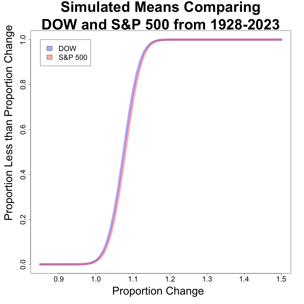
This got me thinking, “Is there a good way to represent how different these distributions are?”. I created a plot comparing the proportion of medians less than a given value for both of these (this is very similar to an estimated CDF plot). I first looked at this plot for the means, and then the median.
The plot for the means are very similar with no noticeable differences in the plot. Generally speaking, we would expect a better performing index to have a line closer to the x axis for a longer stretch of proportion change.
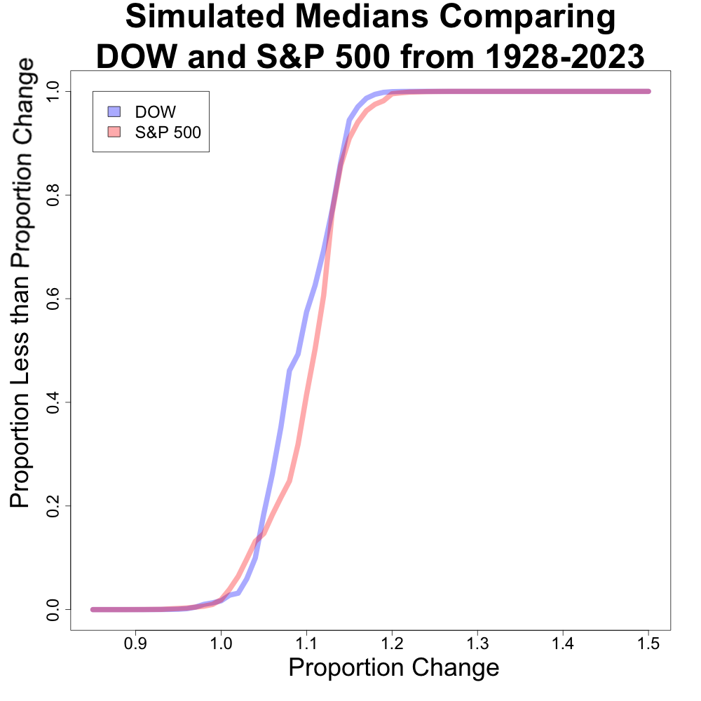
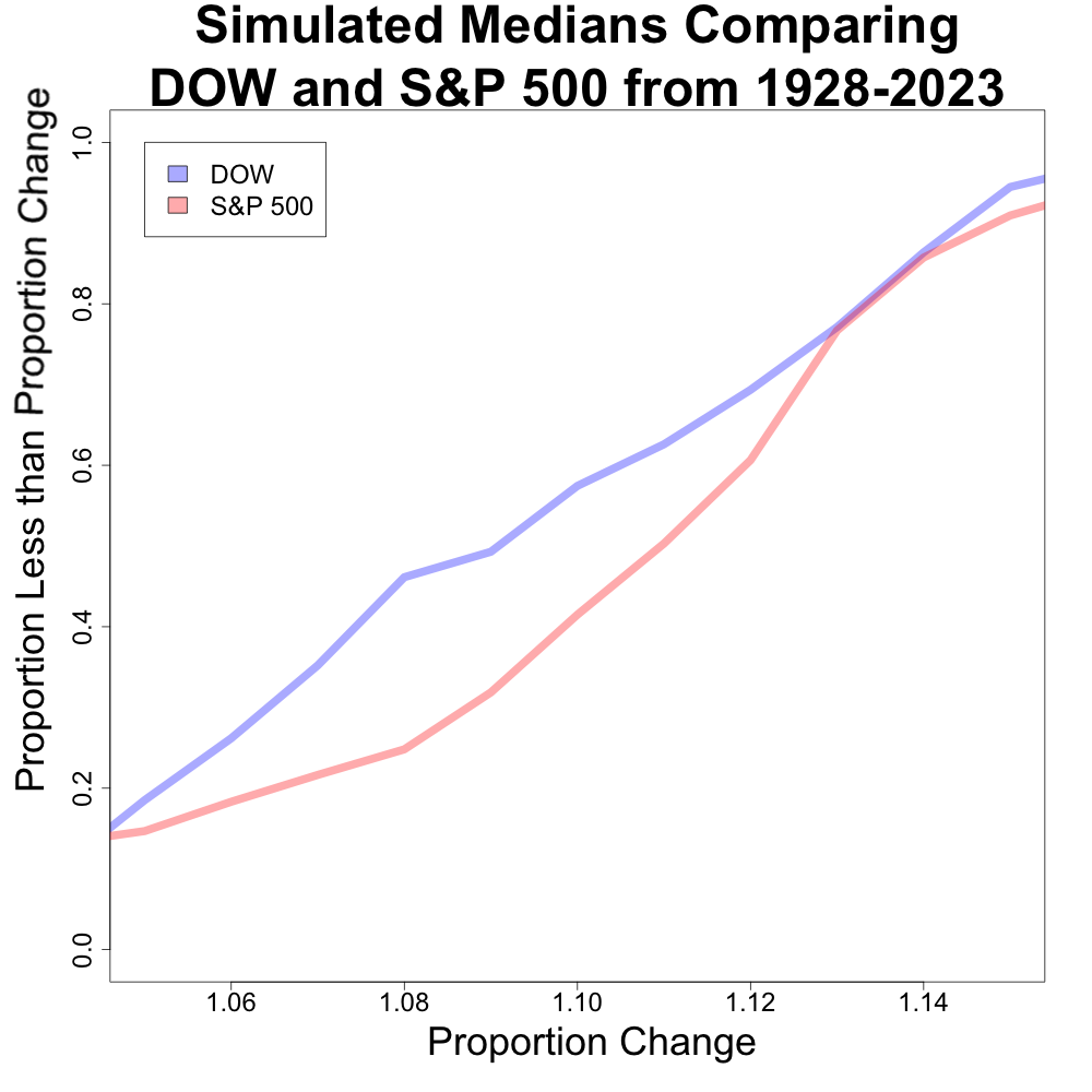
However, when we look at the median counterpoint, we can see some deviations between the x axis values of about 1.06 to 1.14. The next plot looks as a zoomed in section of this part of the plot.
This plot shows that there is a large discrepancy between the two indexes. For example, the distribution of the S&P 500 median has less than 20% of its distribution less than 8%. Conversely, the distribution of the DJIA median has over 40% of its distribution less than 8%. The distributions begin to converge after 1.14.
So, Which Index is Better?
Based purely on historical data and risk tolerance, the S&P 500 appears to be the better choice. Here’s why:
More Consistent Growth: The distribution of the S&P 500’s median return suggests steadier growth potential since it only has one major peak.
Greater Diversification: The S&P 500 tracks 500 companies, offering broader diversification compared to the Dow Jones’s 30 companies.
Are There Reasons to Choose the Dow Jones?
While the S&P 500 might be the analytical favorite, there are potential reasons to consider the Dow Jones:
Social Investing: An investor might have issues investing in many of the companies in the S&P 500. Investing in the DJIA might provide a list of less problematic companies for the investor.
Easier for Self Management: It also might be easier to create a self-driven portfolio without using investment products like ETFs using the DJIA than the S&P 500.
Potential for Higher Returns (with Higher Risk): The Dow Jones has experienced some periods of higher returns than the S&P 500 (as due to the one year with outsized returns for the DJIA in the historical data). However, this comes with the risk of larger potential losses.
The Final Word
The “better” index depends on your investment goals. If you prioritize consistent growth and diversification, the S&P 500 might be ideal. However, if you’re comfortable with potentially higher risk for potentially higher rewards, the Dow Jones could be an option.
Is there anything that I didn’t consider that you would have? Anything that you might have done differently? Let me know and perhaps I can do a follow up to this!
Remember: Regardless of which index you choose, consulting with a financial professional is crucial before making any investment decisions. They can help you create a personalized investment plan that aligns with your financial goals and risk tolerance.
In the age of big data, two professions stand out as masters of making sense of it all: data scientists and statisticians. Both wear the analytical hat, but under each field comprises a difference in training and emphasis. Let’s explore the similarities and differences between these data whisperers.
Statistics: The Bedrock of Inference
Statisticians are the architects of rigorous experimentation and mathematical model building. Their toolbox brims with R, a language tailor-made for statistical analysis. (If you are looking into getting started with R, consider looking into my intro to programming textbook using R. If you prefer a video format, I also have a video series on the topic.) They wield traditional methods like the t-test to unveil relationships between variables and draw conclusions with confidence. Their strength lies in the solid theoretical foundation behind their methods, ensuring reliable and interpretable results.
Data Science: Adapting to the Tsunami of Data
Data scientists, on the other hand, are the agile surfers riding the wave of big data. Python helps them navigate through messy, unstructured datasets. They embrace performance-centric approaches like Support Vector Machines (SVMs) and Random Forests to build accurate predictive models. If you are interested in getting started with building these kinds of models, I would suggest the Introduction to Statistical Learning with R (ISLR 2nd Edition Affiliate Link, Non-Affiliate Free PDF Link). If you prefer a video format, I created an intro to machine and statistical learning video series. While mathematical theory isn’t absent, the focus leans more towards finding the best tool for the job, regardless of its theoretical pedigree.
Bridging the Divide: Where They Converge
Despite their distinct styles, these data gurus share some vital common ground:
Communication: Both speak the language of insight, translating complex numbers into actionable stories for business stakeholders.
Visualization: Data is more than just numbers; it’s a story waiting to be told. Both statisticians and data scientists master the art of compelling visualizations to make their findings come alive.
Actionable Insights: Ultimately, both professions strive to use data to solve real-world problems. Whether it’s predicting greenhouse emissions or optimizing marketing campaigns, their insights drive data-driven decision making.
So, who is better equipped to unravel the patterns within data? The truth is, there’s no one-size-fits-all answer. Each profession and perspective brings unique strengths to the table, and the choice depends on the specific problem at hand. Statisticians offer theoretical rigor and interpretability, while data scientists excel at flexibility and performance.
The ideal scenario? A synergy of these two worlds. Imagine a team where statisticians provide the theoretical grounding and data scientists unleash the power of modern tools. It’s a collaboration that promises to unlock the true potential of data, transforming every industry from healthcare to finance and beyond.
So, the next time you’re drowning in data, remember, you don’t have to choose between these data heroes. Let them join forces, and watch the insights flow!
Note: Bard was used to help write this article. Midjourney was used to help create the image(s) presented in this article.
The US Bureau of Labor Statistics has pointed out the strong demand for skilled data scientists. In my opinion, this is more crucial than ever as companies across industries are scrambling to harness the power of artificial intelligence (AI). But this isn’t just about weaving spells with algorithms; it’s about building bridges between raw data and people to make impactful results.
So, aspiring data wizards, what ingredients do you need to brew the perfect career potion in 2024? Let’s break down the essential skills you’ll need to master for 2024 and beyond!
1. Coding Alchemy: Python, R, and the SQL Elixir:
Think of programming languages as your incantations. Python, R, and SQL are the most potent brews in the data scientist’s cauldron. Python is very powerful for its versatility and vast libraries like NumPy and Pandas. R, meanwhile, is the go-to for statisticians with its focus on statistical modeling and analysis. And don’t forget SQL, the language that unlocks the secrets hidden within databases. Mastering these languages isn’t just about writing code; it’s about understanding the logic and structure behind them, allowing you to wield them with precision and efficiency to complete tasks ranging from the mundane to the arcane.
2. From Raw Data to Refined Insights: Modeling the Future:
Data is the raw material, but the real magic lies in transforming it into actionable insights. This is where your analytical skills come into play. You need to be able to clean, wrangle, and explore data, identifying patterns and trends that might otherwise be illusive. Statistical modeling and machine learning algorithms are your tools for building predictive models, uncovering hidden relationships, and ultimately, understanding what the data is capturing in the world around us.
Remember, data science isn’t just about interacting with machines; it’s about speaking to people. Your ability to translate complex findings into clear, concise, and compelling stories is crucial. Think of yourself as an interpreter, guiding stakeholders (such as team members, managers, or those whom you serve) through the labyrinth of data to actionable insights. Strong communication skills, both written and verbal, are essential for building trust and ensuring your work has a real-world impact.
4. The Unspoken Secrets: Soft Skills Make You a Sorcerer Supreme:
Beyond the technical wizardry, there are unspoken skills that make you a truly exceptional data scientist. Collaboration and teamwork are paramount, as you’ll often be working with engineers, analysts, and business leaders. Further, being able to fit into the team culture is a critical component for enjoying your job. So this isn’t something you can simply ignore and hope will work itself out.
Remember, data science isn’t just about crunching numbers; it’s about applying creativity, critical thinking, and a collaborative spirit to solve real-world problems. So, hone your coding skills, refine your analytical abilities, and unlock the power of communication. With the right ingredients in your cauldron, you’ll be well on your way to becoming a data science sorcerer supreme in 2024 and beyond!
Are there additional topics regarding data science you would like me to cover next? Consider reaching out to let me know what I should talk about next time!
Note: Bard was used to help write this article. Midjourney was used to help create the images presented in this article.